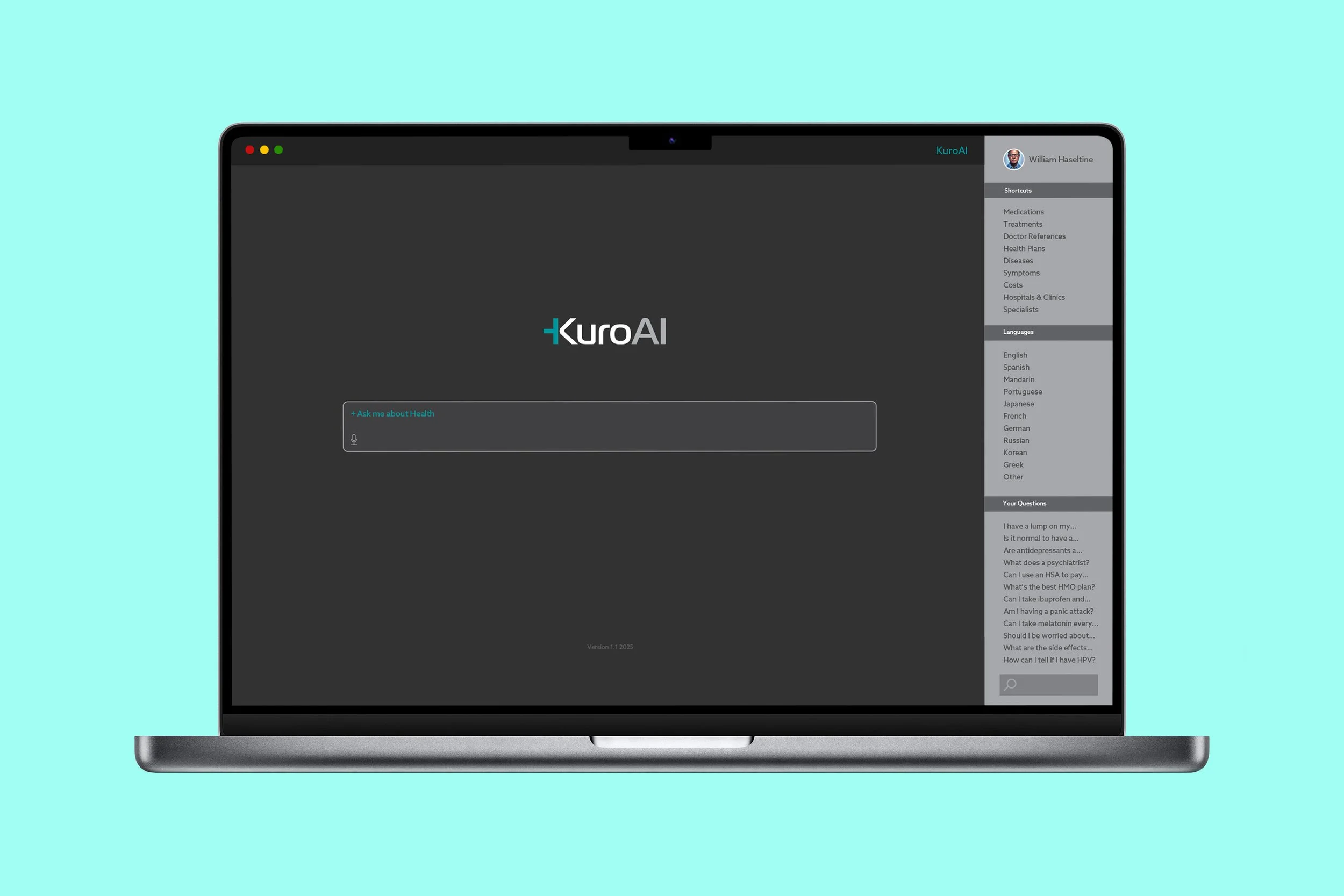
KuroAI
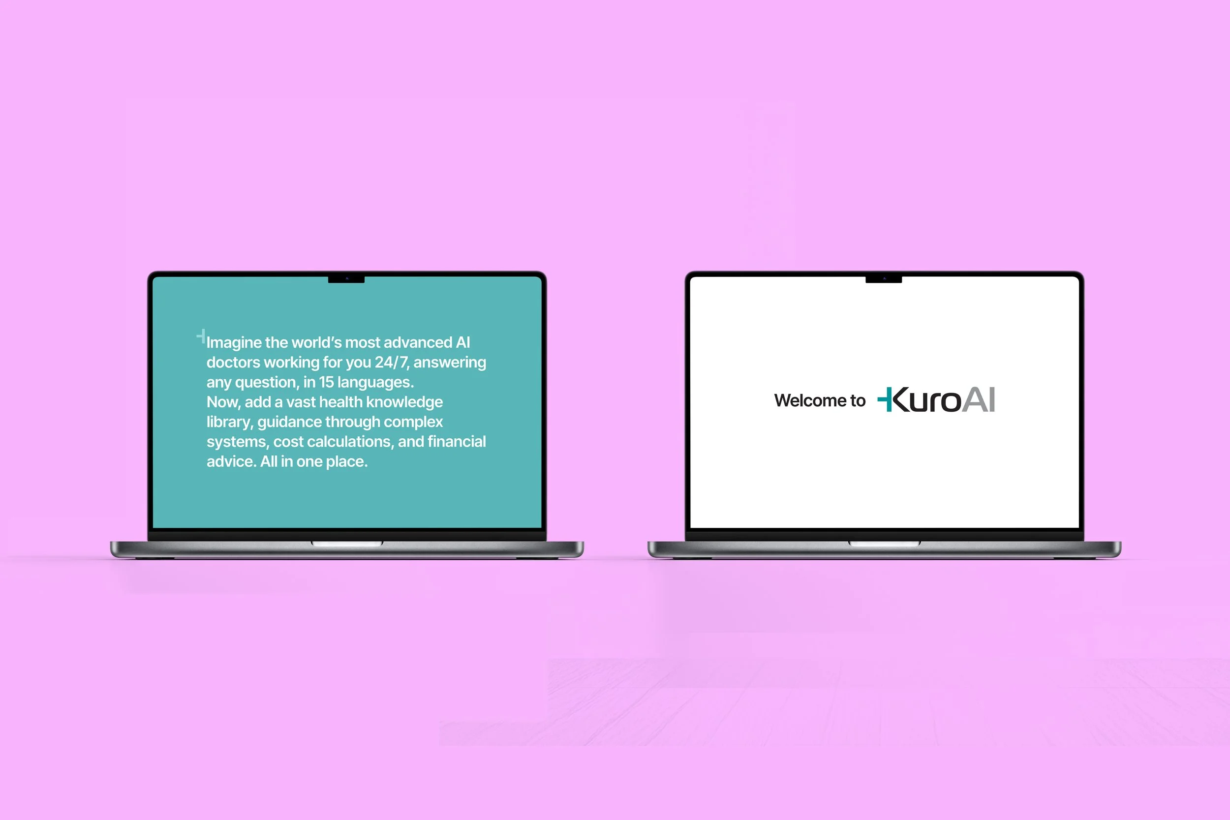
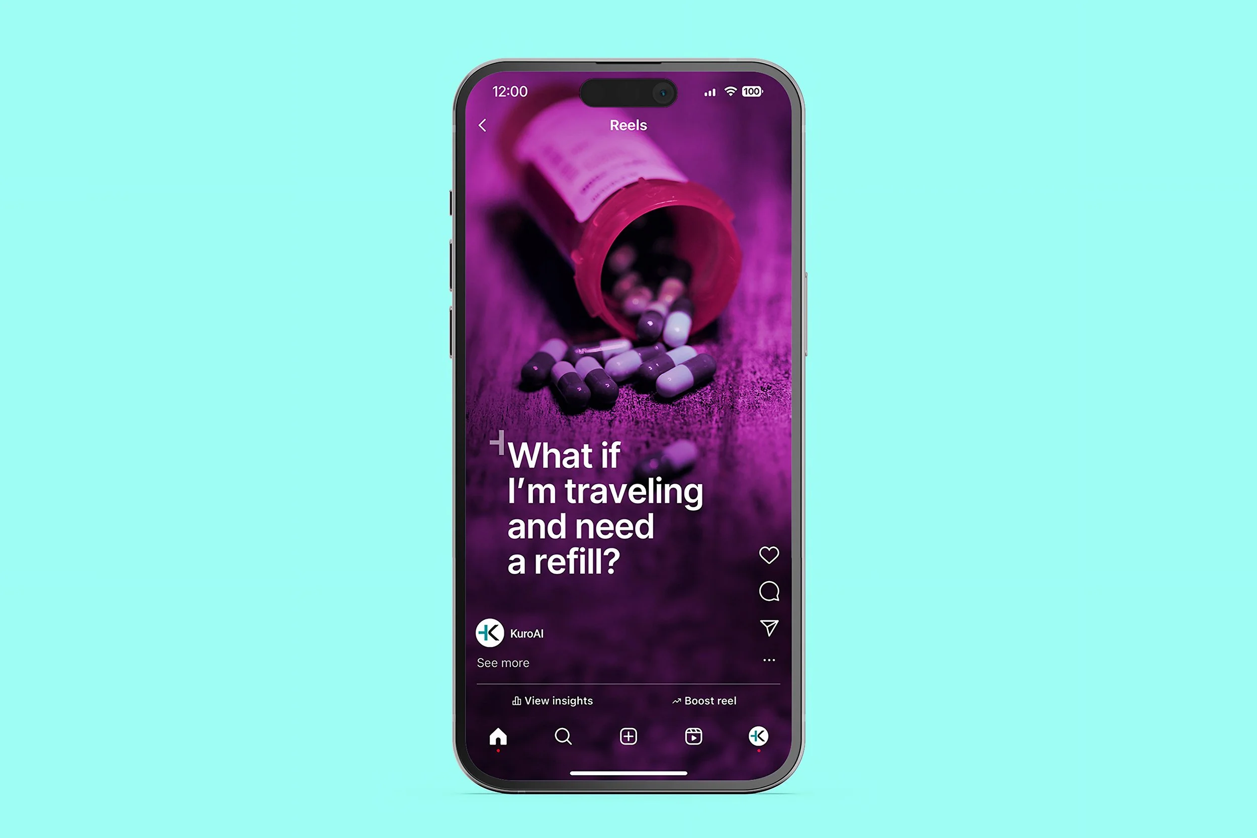
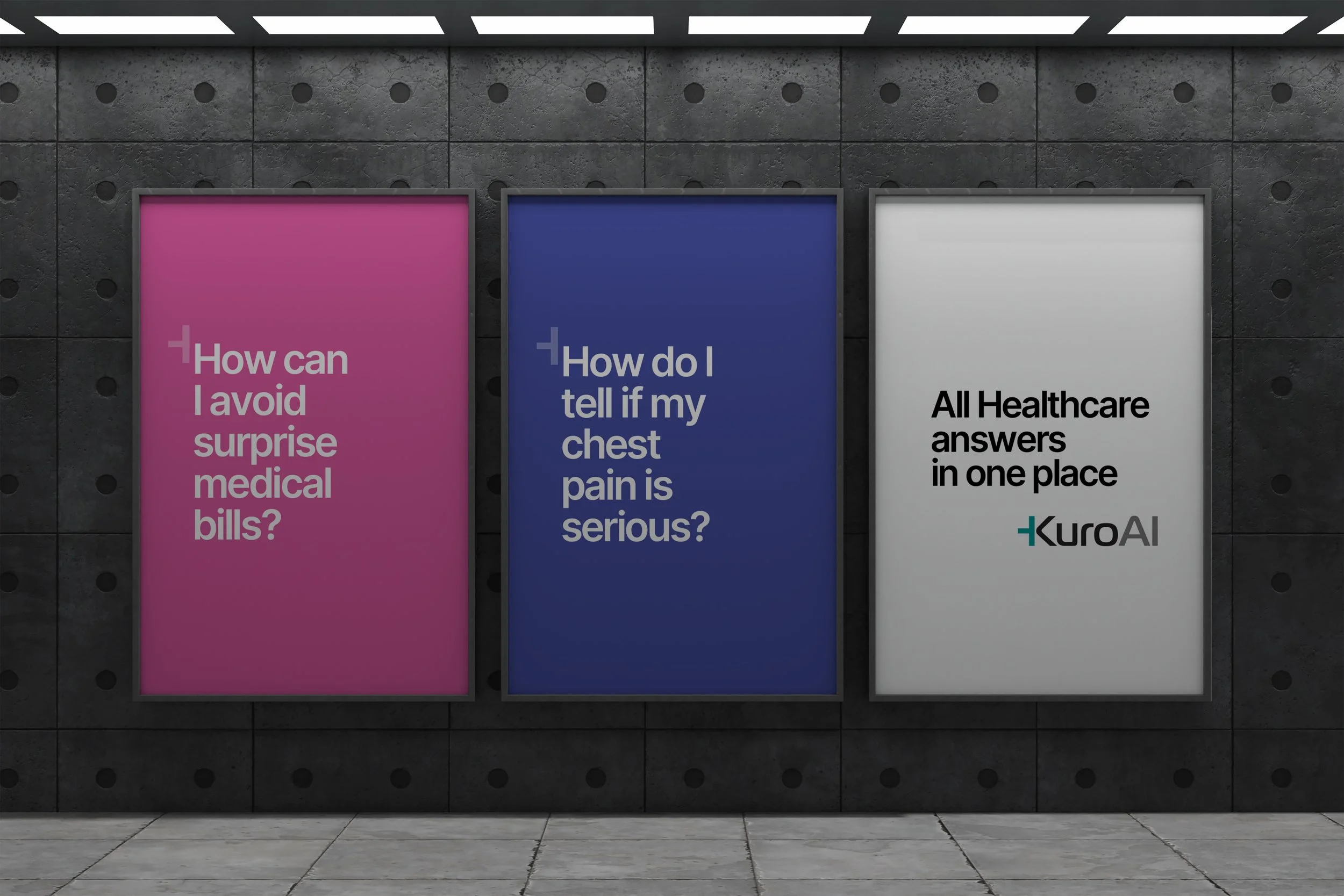
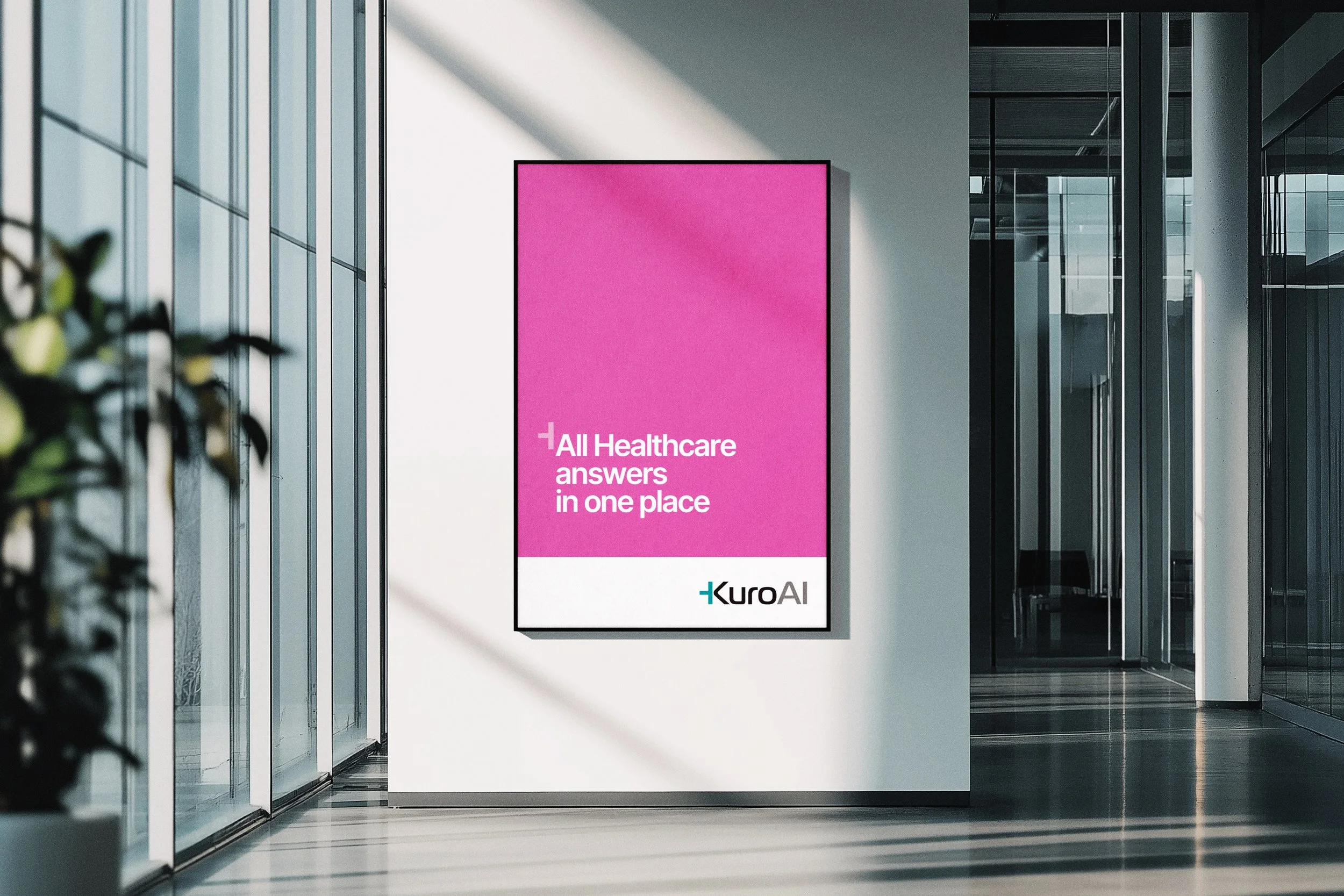
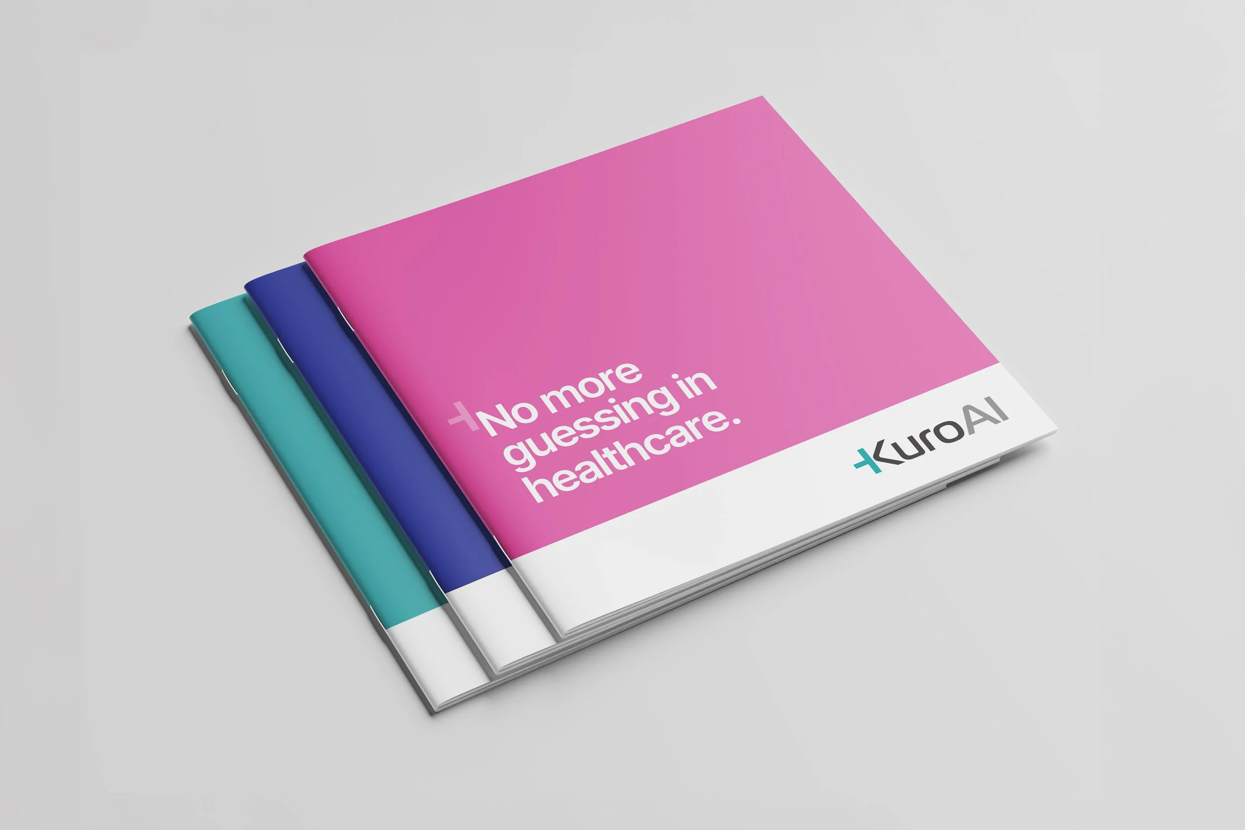
The launch of KuroAI introduced a brand built on intelligence, trust, and accessibility—designed to make navigating healthcare as seamless as asking a question. Inspired by the colors most commonly seen in doctors’ and nurses’ scrubs—light teal, pink, and bluish purple—the visual identity balances familiarity with innovation, making advanced AI feel both approachable and powerful. The art direction revolves around the most common healthcare questions people ask, shaping a design language that is clear, intuitive, and engaging.
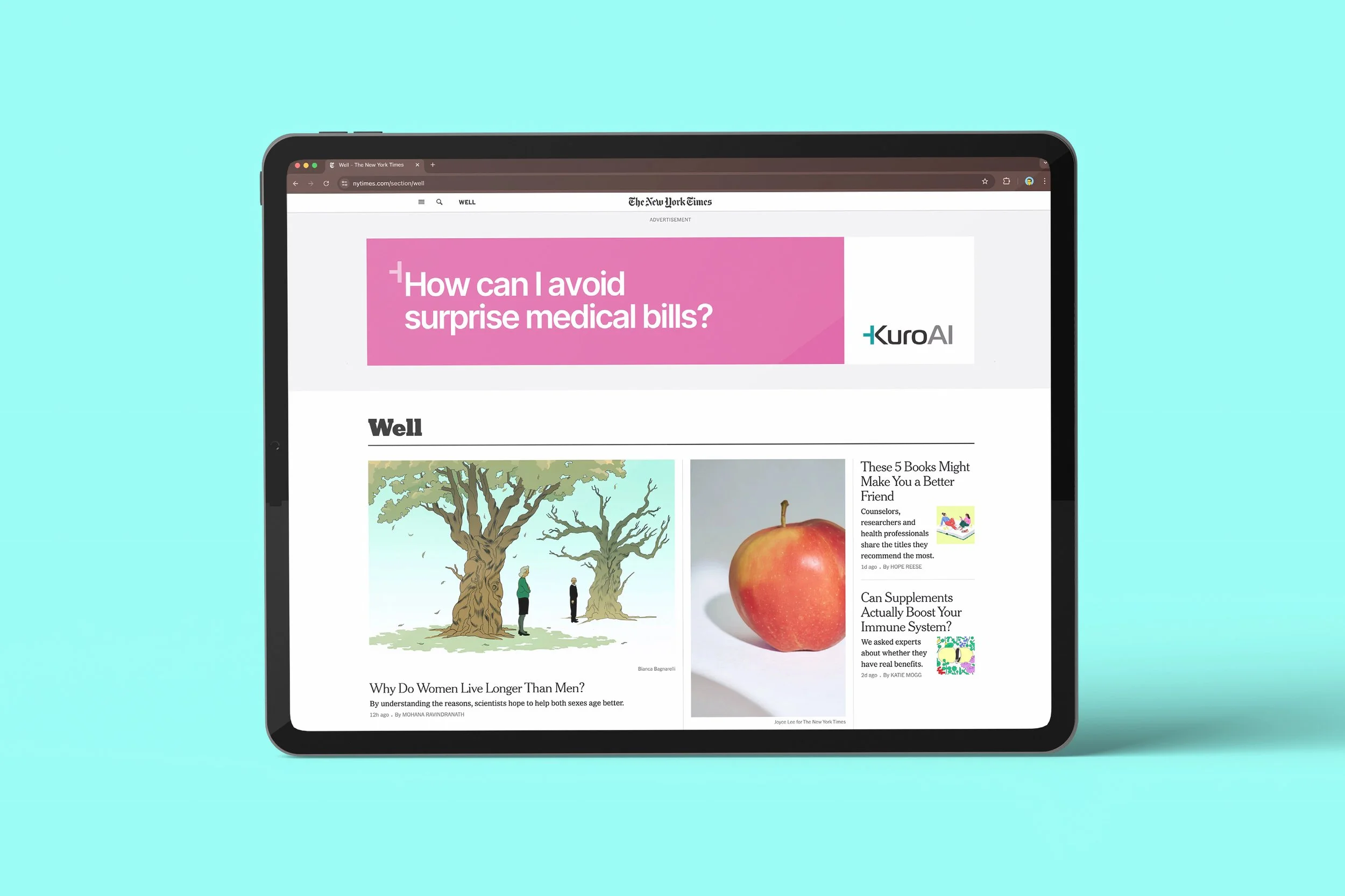
At the heart of the brand is the KuroAI logo, featuring a distinctive half-cross—an intentional nod to healthcare that also functions as a dynamic design element, highlighting the beginning of every question throughout the campaign. Every visual choice, from typography to layout, was crafted to remove barriers, ensuring that information is not only accessible but inviting. Because in healthcare, clarity isn’t just helpful—it’s essential.