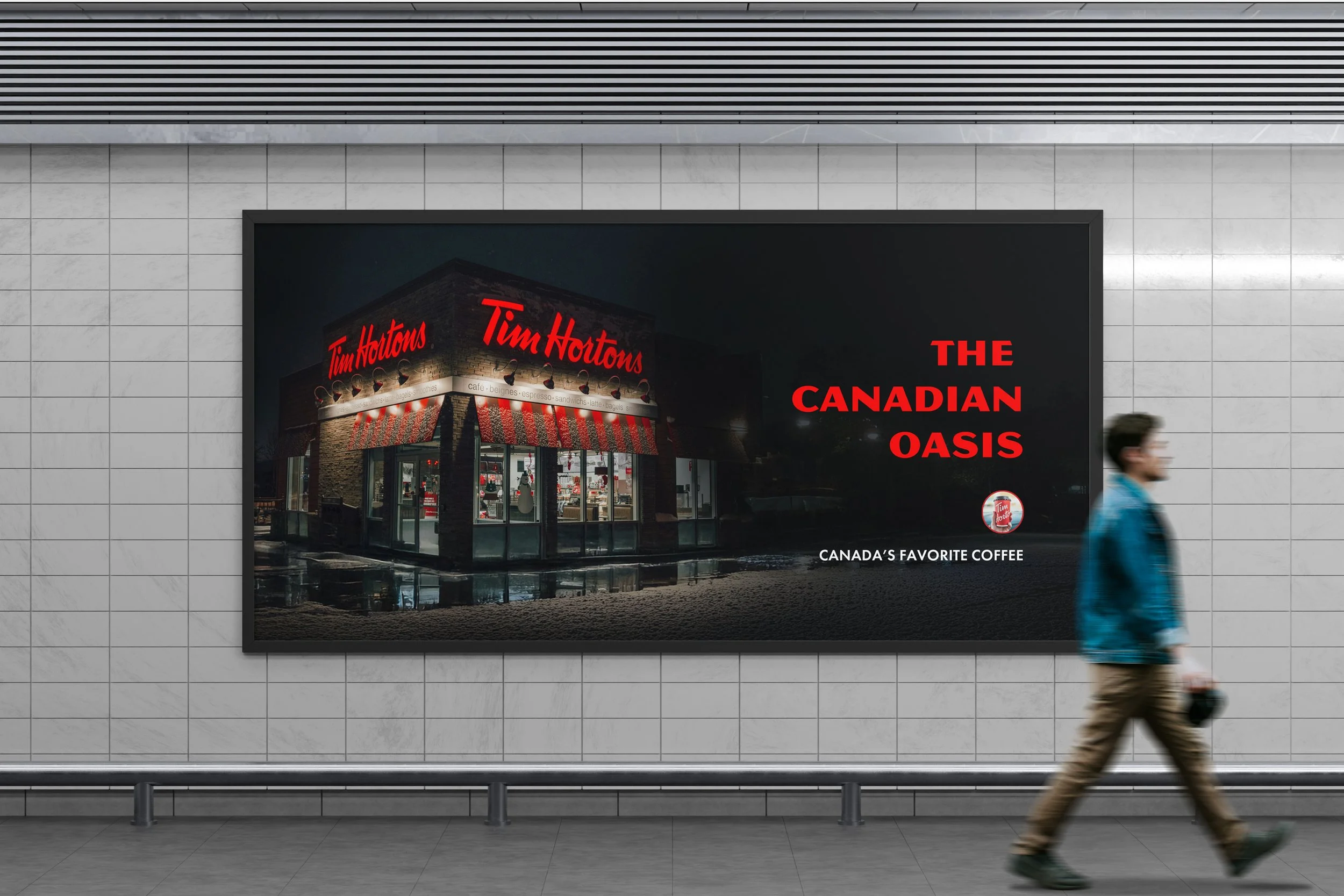
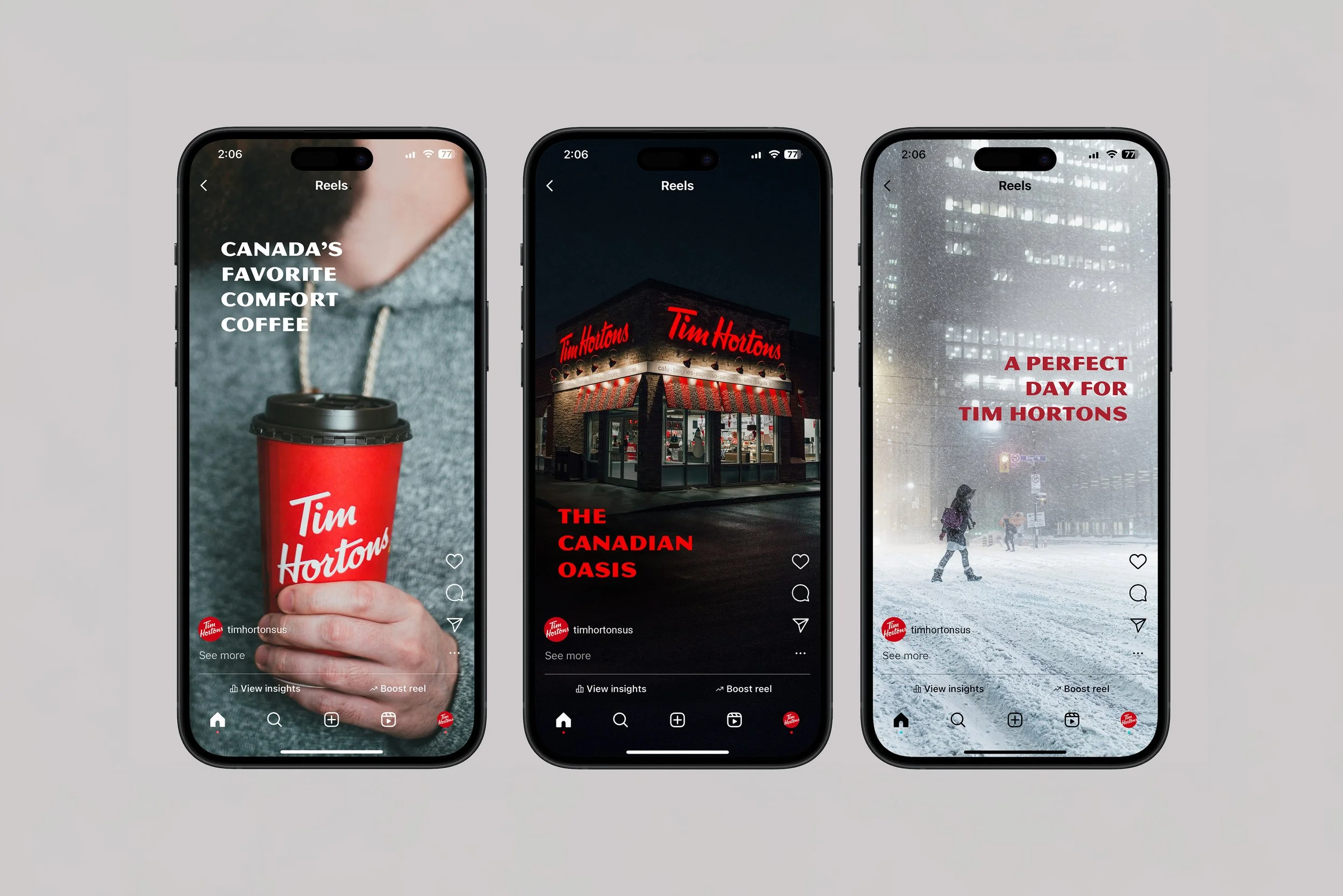
Tim Hortons
This campaign embraces the everyday moments of Canadian life, using humor to highlight the contrast between the cold and the comfort of a Tim Hortons coffee. The art direction plays with this visual contrast, where the bold red of the Tim Hortons brand stands out against snow-covered scenes, creating a strong, recognizable identity. Through billboards, posters, backlit displays, and digital media, the campaign delivers a cohesive and engaging experience. The result is a visually striking and engaging campaign that connects with audiences through both design and storytelling.